
Oldetowne Landscape Architecture
This year I had the great fortune of working on and completing a really fun print series for Oldetowne Landscape Architecture with the fine folks at Tribe, an independent brand design agency located in Frederick, Maryland. Oldetowne worked with Tribe to develop a strategy which would help set their print advertising apart from the industry (which was traditionally photography based).
The solution Tribe came up with was exciting: show a series of illustrated seasonal back yard landscapes through a window. This invitational approach would draw viewers in while the illustration would set the ad itself apart.
Needless to say with a brief like that, I was thrilled with the opportunity. It was also a fun challenge because these outdoor spaces aren't typically as vast as most of my landscape work so I was able to explore depth in new ways - which I'll get into below!
Spring

Oldetowne · Full Spring Illustration
Sketches
The first piece we worked on was the Spring seasonal landscape. With this piece, we wanted to show fresh foliage, newly budding trees, and a quiet moment shared between a couple enjoying a cup of coffee. One of the really exciting aspects of these pieces for me was there was no design I was asked to follow for the back yard itself - which meant I got to study Oldetowne's landscape architecture and create based off what they've done (you should really check their work out - it's stunning!).

Oldetowne · Sketches
For the sketches of this piece, I opted to work in color since the mood and tone was important to nail down early. I wanted to make sure that the scene was serene and the composition would invite exploration. I utilized the trees in the foreground and background for scale and seasonal hints while the couple enjoyed a quiet moment in their backyard getaway.

Oldetowne · Final Illustration
Once the final illustration was brought to life, I added in the window treatment on top, making sure to leave space at the bottom of the scene for type and branding placement. For the window treatment, we opted to keep it more graphic, creating a simple solution which would still allow the illustration to stand out.


Summer

Oldetowne · Full Summer Illustration
The summer piece was one I was really excited to tackle. The premise was to show a backyard bbq with neighbors, a pool feature, and an atmosphere where you could feel the heat of summer but find relief in shade and in the water.
Sketches

Oldetowne · Sketch
The sketches for this piece were once again done in color so I could sketch with atmosphere. I knew early on that I wanted to use warm colors everywhere with pockets of shade and cool colors for the pool. I also thought it would be fun to introduce pergola's over the glass sliding door and within the scene itself. In the distance we see other homes as more and more neighbor make their way to the party.
When I work on scenes like this, while I do want the overall composition to tell a story (in this case, 'backyard bbq'), I look for other ways I can inject pockets of narrative within the piece: a man cheering a kid on as he cannonballs into the pool, a conversation between 3 people under the shade of the pergola, a woman expertly seasoning food she's been prepping on the grill, a family looking on as they walk toward the party). Looking for these moments within the illustration creates scenes I want to illustrate, and hopefully pieces viewers delight in exploring.

Oldetowne · Summer Black and White
With the Spring piece, I opted to work on the final illustration directly in color while the Summer and Autumn pieces, I worked in black and white values first, then applied color later. I did this simply to explore different working methods based on what I felt like doing. Gotta keep things interesting at all times!

Oldetowne · Final Illustration
Color
With the black and white stage completed, I moved onto color, using my initial color sketch as my guide. All that remained was to place the glass sliding door in front of the scene and with that, the Summer season was complete!


Autumn

Oldetowne · Full Autumn Illustration
Autumn is by far my favorite season of the year and it just so happened to be the last piece in the series. The premise for this piece was simply to show a family enjoying their time together in front of an outdoor fireplace. What I liked too was that the Spring illustration took place in the morning, the Summer piece in the middle of the day, and the Autumn piece in the evening. Everything felt like it had come full circle.
Sketches

Oldtowne · Sketches
I opted to return to my traditional illustration process on this piece (pencil sketches, black and white flats, color) and spent time figuring out how best to show the scene. I knew I wanted the fireplace to be the focal point and I thought it would be fun to suspend lights above the family to create a fun atmosphere. It was also a good way to bring in some depth to the piece (which can be challenging to do with a night scene).
Black and White

Oldetowne · Black and White
I always say that if a piece works in black and white, I have more confidence it can work in color. When I was working on the black and white version of this one, I was really getting excited with how things were coming together. I felt like the shapes I was landing on worked well and the lighting worked better than I had anticipated.
Color

Oldetowne · Final Illustration
Adding the color to this one was a lot of fun, especially with the cast lighting from the fire and the light from the string lights. All that was left was to add the window on top of the scene which really helped frame the moment with the family.


And with that, my friends, the series is completed! Big thanks to Robby Prall from Tribe for the great direction and oversight. He helped bring this one together big time! And big thanks to the folks at Oldetowne Landscape Architects - I hope my pieces did their landscapes justice.
Lastly, thanks to my agent Deborah Wolfe and her staff who work tirelessly behind the scenes to take care of all that needs to happen to make projects like this possible. I truly appreciate it!

Variety Magazine
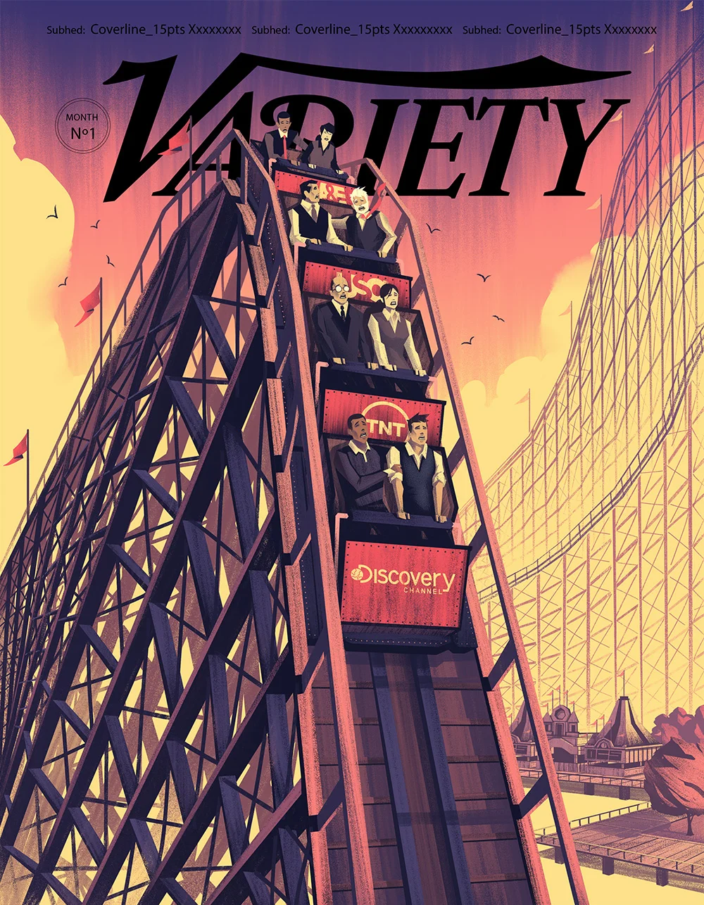
Cover for Variety Magazine
This month I had the opportunity to illustrate my first cover for Variety Magazine (which also happened to be my first cover of any magazine!) with art director, Chuck Kerr. It was a quick turnaround time but I thoroughly enjoyed working with Chuck on the project and am excited to share the results with you. Big thanks to Chuck for the assignment and great art direction and to my agent, Deborah Wolfe, for her help in taking care of so many details so I can focus on illustrating.
Sketches
When I received the brief and read that I'd be illustrating a roller coaster, I was genuinely excited. There's something about vintage roller wooden roller coasters which just seemed to click with me aesthetically so I thought the pairing of style and subject matter was on point. Chuck sent me the cover template to draw on and I quickly jumped into sketches to came up with a few options, leveraging the old tracks as the main composition element.
Sketch Option 1
SKetch Option 2
Values
After reviewing the sketches, the consensus was the death defying drop of the roller coaster needed to be the most prominent aspect of the illustration. This fit with the article and overall look Variety was after so it was time to jump into digital painting.
As with my typical process, I initially worked in black and white to make sure my lighting and values were working well. This kind of linear approach is something I use so I can focus on one thing at a time and not get overwhelmed by too many things happening at once.
Cover Flats
Color Options
With the flats, lighting, and brushwork in place, it was time to move onto color. I came up with a few options which brought out various aspects of the illustration.
Color Option 1
Color Option 2
In the end, the sunset image was the winner and our cover was born! Here are a few of the detail shots to see the textures and styling that went into everything:


Spot Illustrations
This particular assignment also came with 2 spot illustrations: a shooting gallery and an exec struggling to lift a hammer for a Test of Strength game. Spot illustrations can be a lot of fun because they challenge me to focus on capturing an idea simply and effectively. These were fun for that same reason, but with the added bonus of subject material I really enjoy drawing.
Spirit Magazine
I had the privilege of doing some editorial illustrations for Spirit Magazine, Southwest Airline's in-flight magazine, thanks to designer Britta Hazel. This was one of the best editorial illustration experiences I've had thanks to Britta, an interesting article, and a challenging illustration! Its also the biggest amount of real estate my illustrations have appeared in a magazine - which was really exciting to see once it was printed.
First up, the main illustration for the article. Not only was I pleased with how the illustration turned out, I really loved the layout of the article (you'll have to pick up the magazine to see that - but its well worth it!). Illustration + good design (thanks to Britta) is always something I appreciate.
Spread Illustration
Next up is the spot illustration. This piece actually turned out to be one of my favorites even though its a very straight forward shot. Sometimes those are the best solutions to the challenge!
Spot Illustration
These are the initial sketches I started out with. I typically don't do this many sketches for an editorial assignment, but I was really enjoying the exploration and wanted to push myself to find a solution I was satisfied with. Its a good lesson to learn: not every illustration comes easy!


Once we picked the basic camera angle, composition, and idea, it was time to move forward. These were the rough sketches I developed just to make sure the placement was correct and all the elements requested in the brief were present and accounted for.
Rough Pencils
Rough Pencils 2
From there I opted to move to blocking in values. Blocking color in is part of my process and I enjoy working in Black and White. It helps me focus on making strong shapes, solid lighting, and hopefully leads to a good finished piece. I've always believed if you can make it work in black and white, that increases your chances of making it work in color.
Value Roughs
Value Roughs
And here is a color variation I presented as an alternative to the colors which were chosen. The benefit of my working method is its fairly easy to change colors. Every shape and object is on its own layer and gets its own color treatment. This allows me to change all the colors at once with layer adjustments or go in and change specific objects to colors of my choice. It can be time consuming, but it'll save time if I'm anticipating a lot of changes or back and forth with my clients.
Color Alternative
Color Alternative
Weber Preproduction Art
I had an opportunity to work with Denver's very own Rabble + Rouser with Art Director extraordinaire Shum Prats on some preproduction art for Weber. For those of you who don't know, "Preproduction Art" is concept art used for reference, exploration, and direction for campaigns in the marketing world. In this case, I did a series of 3 concepts which would be used as exploration and reference for a photographer R+R was using to develop a set of summer ads.
The turnaround was tight, but the direction was solid and we got some fun results out of it.
Preproduction Art 1
Preproduction Art 2
Preproduction Art 3