Beekman 1802


This year I had the good fortune to work with the folks from Beekman 1802 on a set of illustrations for their limited edition “Twinkle Twinkle Little Farm” holiday packaging. The packaging afforded me the opportunity to illustrate 5 magical scenes capturing the heart and spirit of Beekman Farms - and each piece was printed on their gift sets offered through the Home Shopping Network.
Creating these pieces was a genuine treat for me, topped only by seeing them printed in person on foil paper around hand folded packaging. Seriously, the packaging quality of the Beekman Twinkle Twinkle collection is some of the best I’ve seen. Be sure to check out HSN’s page to grab these collectibles while they last!
And now, let’s dive into how these pieces were created…
Sketches
Once I received the brief from Beekman’s creative team, I jumped into Procreate using my iPad Pro & Apple Pencil to sketch out the basic composition for the pieces. At this point, we didn’t get into color as we were more interested in establishing the overall look and feel of the compositions for each piece.
I spent a lot of time pouring over the reference photos Beekman provided me to make sure I got the farm accurate for the 2 pieces which required accuracy. For the remaining 3 pieces, I was given license to create based purely on mood and feel - which I love doing (especially for Christmas themed pieces).


Flats
Once the sketches were completed, I jumped into creating the illustrations in black and white. Since these were going to be part of a collection, I wanted to make sure the color palette used for the series was uniform. My plan once I finished the black and white version of the pieces was to use Gradient Overlays on top of the pieces to uniformly apply color to the illustrations. I don’t always use this approach when creating a series of illustrations, but on some applications it works quite well (such as this one) and the results are a lot of fun.

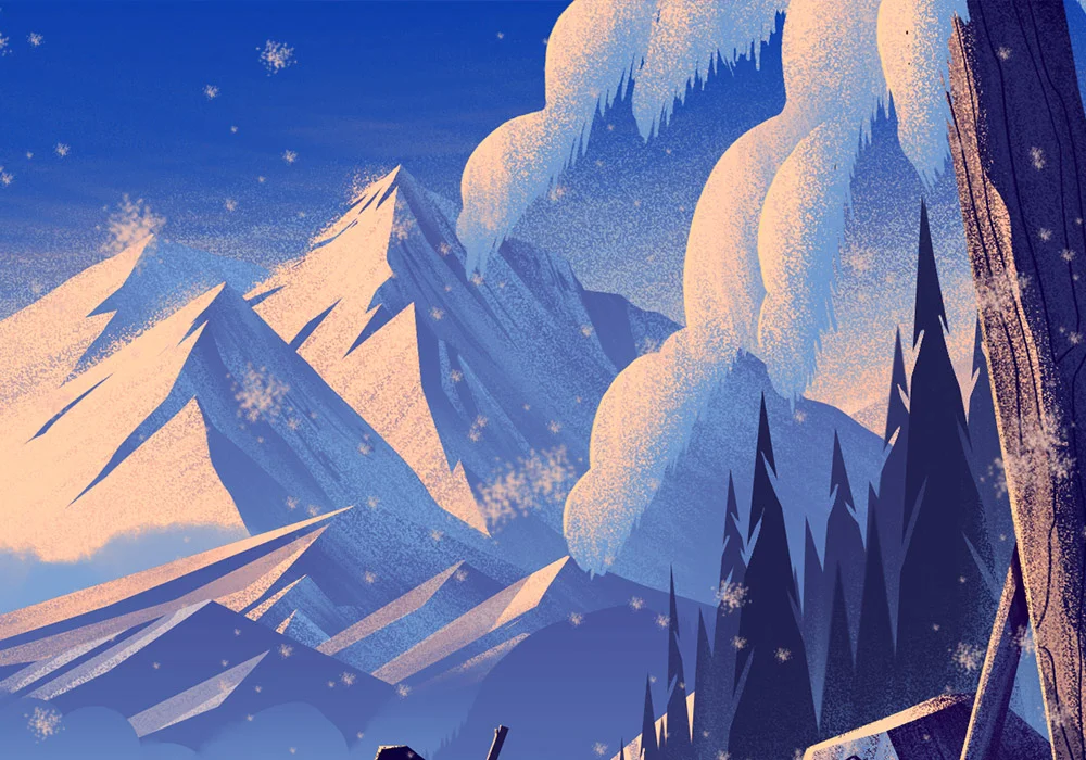
Beekman 1802 · Farmhouse Flats

Beekman 1802 · Farm Flats

Beekman 1802 · Moonlit Hills Flats

Beekman 1802 · Holiday Star Flats

Beekman 1802 · Winter Village Flats
Color
As mentioned above, when it was time to color this series of illustrations I opted to use a gradient overlay to uniformly apply the chosen color palette to each of the illustrations.

For those who are interested in seeing what this gradient looks like, here’s a shot of the Gradient Editor in Photoshop. This a fun method of applying color, though it can be tricky if there are specific areas of the illustration you want to color a certain way. So long as your values are correct in the black and white illustration, the Gradient overlay can yield results such as the ones you see below:

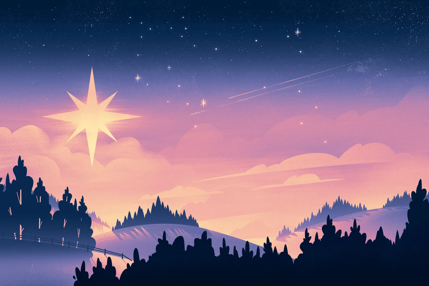
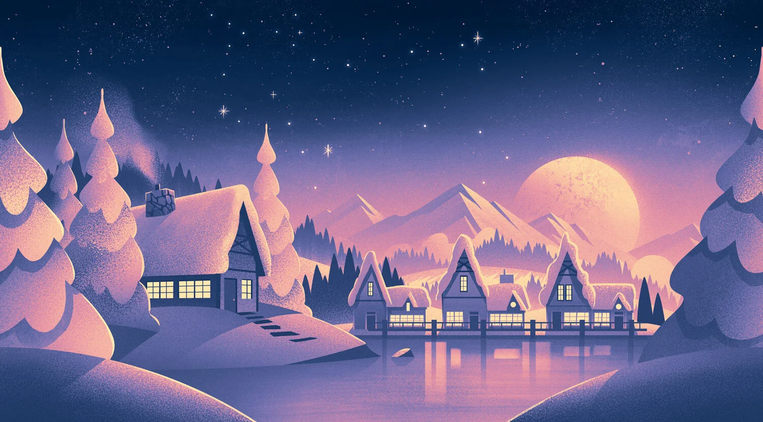
Beekman 1802 · Farmhouse

Beekman 1802 · Farm

Beekman 1802 · Moonlit Hills

Beekman 1802 · Holiday Star

Beekman 1802 · Winter Village
As I mentioned, you should really see about getting your hands on the packaging these pieces were applied to. The foil packaging these were printed on really makes the illustrations sing.
Huge thanks to the folks at Beekman for giving me the opportunity to collaborate with them on this project. It was a lot of fun to work on and seeing the product first hand was exciting for me and my family.
Stay well, everyone!
Field & Stream Father Son Adventure
I’ve had the privilege of working on a handful of illustrations for Field & Stream magazine and each time, it’s been a true joy. This year I had the opportunity to reconnect with design director Russ Smith to tackle a really fun illustrated spread for a story written by T. Edward Nickens.
It’s been a while since I’ve done an editorial illustration breakdown so I figured this was the perfect piece to jump back into some of the techniques I use when bringing these kinds of scenes to life.

Field & Stream | Father-Son Hunting Illustration
Sketches
The first step after I’ve read the brief & the article is to figure out how to structure the illustration to best showcase the key elements of the scene. This typically starts with me thrashing around on the digital canvas for a while until I land on a few composition ideas to work from.
Illustrator Tip: One of the ways I overcome artist block when working on pieces like this is to start by sketching the most straight forward, generic, low hanging fruit option I can think of. Once I have that sketch worked out (which usually doesn’t take long), I think of it as my ‘safety option’: if the worst happens and I can’t come up with a single idea beyond this, I’ll at least have an option to show. The nice thing about this trick is it frees my mind from worrying about not having ‘something’ to send the client. From there, I start exploring more freely and after a while, I’ll end up with lots of different ideas. The funny thing is every once in a while, that ‘super simple quick’ idea ends up being the strongest.

Field & Stream | Father-Son Hunting Sketch
Color
Since I do all my sketching in Procreate, I’ve been enjoying tossing rough colors behind the sketches just so I have an idea where I’m headed for the final. Russ provided me a handful of photos of the environment the story took place in so finding the right color mix was fairly simple. I wanted to palletize the colors to bring that vintage look to the whole thing - and this is what I came up with:

Field & Stream | Father-Son Hunting Color Rough
With the rough color sketch approved, it was time to paint this beauty. I always love this part because I can throw on some music, and get lost in the details of the scene. I love being able to paint every part of the illustration and before I know it, I’ll look up to see that everything has been addressed. That’s when I know the piece is done.


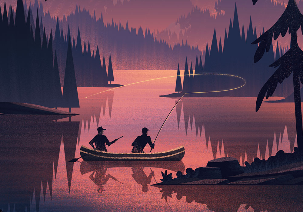
Field & Stream
One of the most enjoyable projects I get to take on from time to time is editorial illustrations for Field & Stream magazine. The reason I love working on these so much is it affords me the opportunity to create quiet moments of stillness in the wilderness, showcasing the beauty of our world and creating visuals for compelling stories. This month's article was no exception. The article, titled "How to Make the Most of the Karma Hatch", written by T. Edward Nickens, sets the stage for the scene you see above. Here's how it was made:
Pencils
As per my usual process, I like to create rough sketches to find my composition. Recently I've been working on the iPad Pro + Apple Pencil because it affords me all the power of a digital tool with the comfort and control of a pencil and paper (my favorite!). Its made digital sketching a true joy and I've been pleased with the results of adding it into my workflow.
With this piece, I wanted to create a powerful sunset scene in which we'd see 2 fishermen as they fish in a treasured, hidden location. Since it was a sunset, I knew I wanted to paint lots of light into the water to really help set the mood - as if the fishermen were paddling through the shadows into that perfectly lit spot where they'd find their catch.
Flats
Once the pencils were in place and approved by the client, it was time to move into flatting and texturing. This is where I try to make the lighting, shaping, and texturing all work together. I typically start with the background, setting the sky and distant mountains in place. From there, I work forward adding each layer until I hit the foreground. From there I'll go back in and make adjustments and small additions to help set the piece off. Once its working in this stage, I have confidence it will work in color.
With the color in place, I send it to the client, and that's that! Big thanks to my agent, Deborah Wolfe, and the rest of her team for helping me to bring in fun projects like these. I'd also like to thank James Walsh from Field & Stream for continuing to give me opportunities to illustrate pieces like this. It means a lot to me to have repeat business, especially from clients I enjoy working with as much as this one.


Luxembourg Cover 1
2015 · Luxembourg Cover
At the end of a very busy 2015, I had the honor and privilege of working on a really fun winter piece for Merkur Magazine, a magazine published by Luxembourg's Chamber of Commerce. The piece was used as the cover of Merkur Magazine, as well as a poster insert within the magazine's pages. It accompanied an article talking about the uncertain financial future of Luxembourg which needed to strike a precarious balance of hope and concern, while fitting in with the Christmas / Holiday / Winter season.
Once I received the brief from Patrick Ernzer, I spent a lot of time researching Luxembourg through loads of image searches, Google Earth, and written descriptions of its History. Part of what makes being an illustrator so fun for me is working with clients all over the world. It gives me an opportunity to learn about new cultures and locations and discover beauty all around. With the brief in hand and the mood and tone in my head, I set off with sketches.
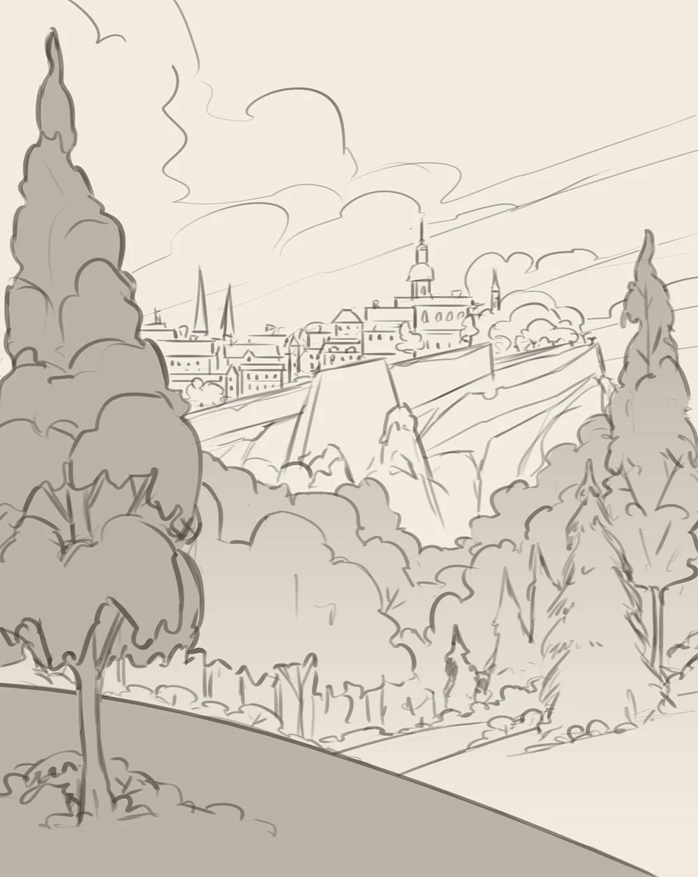
Sketch Option
I chose to illustrate a section of Luxembourg called Old Town Grund, which has an amazing array of structures resting on cliffs and old medieval fortifications. From a content perspective, I thought the landscape and architecture worked well to show the history of Luxembourg and the questions surrounding its financial sustainability without dropping into despair or an overly cheery mood. The sketch was approved with a few tweaks and it was off to color.
Black and White version
As per my typical process, I took to working in black and white values to establish the shapes, textures, and lighting. I really wanted to capture depth in the piece while showing a snow covered landscape. Snow can be a tricky thing to paint because it brightens everything up so much and often hides depth depending on the time of day. I always enjoy casting long shadows within my pieces to define form and composition, so I opted for a moody sunset lighting. With the flats and textures in place and the lighting defined, it was off to color.
Luxembourg Final Illustration
While I do push a lot of my color values, I actually have a ton of reference photos I use to guide my efforts. Living in Colorado, I am never short on dramatic sunsets or sunrises. Every time I see one that stops me in my tracks, I snap a few shots and store them away for future reference. Its a great habit to get into because after a year, you'll have a full library of seasonal lighting which you can use for your work - and because you were actually there taking the photo, you can remember what that lighting felt like (which is very important when you're trying to convey mood in a piece).
Here are a few detail shots you'd see if you had the poster:


Big thanks to Patrick and his team for all their help and for the opportunity to work on such a fun project. We're slated to do a bunch more covers together next year and I can't wait to see what we're able to accomplish together!
I also want to say Thank You to my agents, Deborah Wolfe & Lisa Pomerantz for their tireless efforts and for being wonderful agents. 2015 turned out to be a really great year and I couldn't have done it without their help.
Lastly, big thanks to YOU for taking the time to follow along and reading my babble. I wish I had more time to be able to respond to everyone but please know that I truly appreciate all the comments, likes, retweets, etc. I never imagined an online community being a reward of this profession but being a part of it helps encourage me to continue growing and working hard to pursue this craft.
Beauty is all around and is desperately needed in what can be a very dark world. I hope True Beauty finds you in your day to day and I wish you a Merry Christmas & a Happy New Year.
-Brian
Field & Stream: First Hunt
Field & Stream · First Hunt
There are some pairings that are just meant to go together: Peanut butter & Jelly, Beer & Burgers, Bacon & Everything. In 2014, another such pairing was made when I was given the opportunity to work with Field & Stream. Field & Stream is one of my favorite magazines and their subject matter fits right in with the things I love illustrating the most.
The story I was asked to illustrate (which you can read here: Great Family Stories ) was written by Rick Bass. As a father of children who are growing way faster than I want them too, I was very moved by Rick's story. It was inspiring and really helped get me in the right mindset to create a piece that feels as much a tribute to my daughter and I as it does to Rick and his daughter.
The Editorial Illustration Process
Thumbnails
Here is a thorough breakdown of the process I use to create editorial illustrations (or any illustration for that matter). I was given the brief by Russ Smith. My wonderful agent, Deborah Wolfe, helped lock in all the details so I was freed up to create.
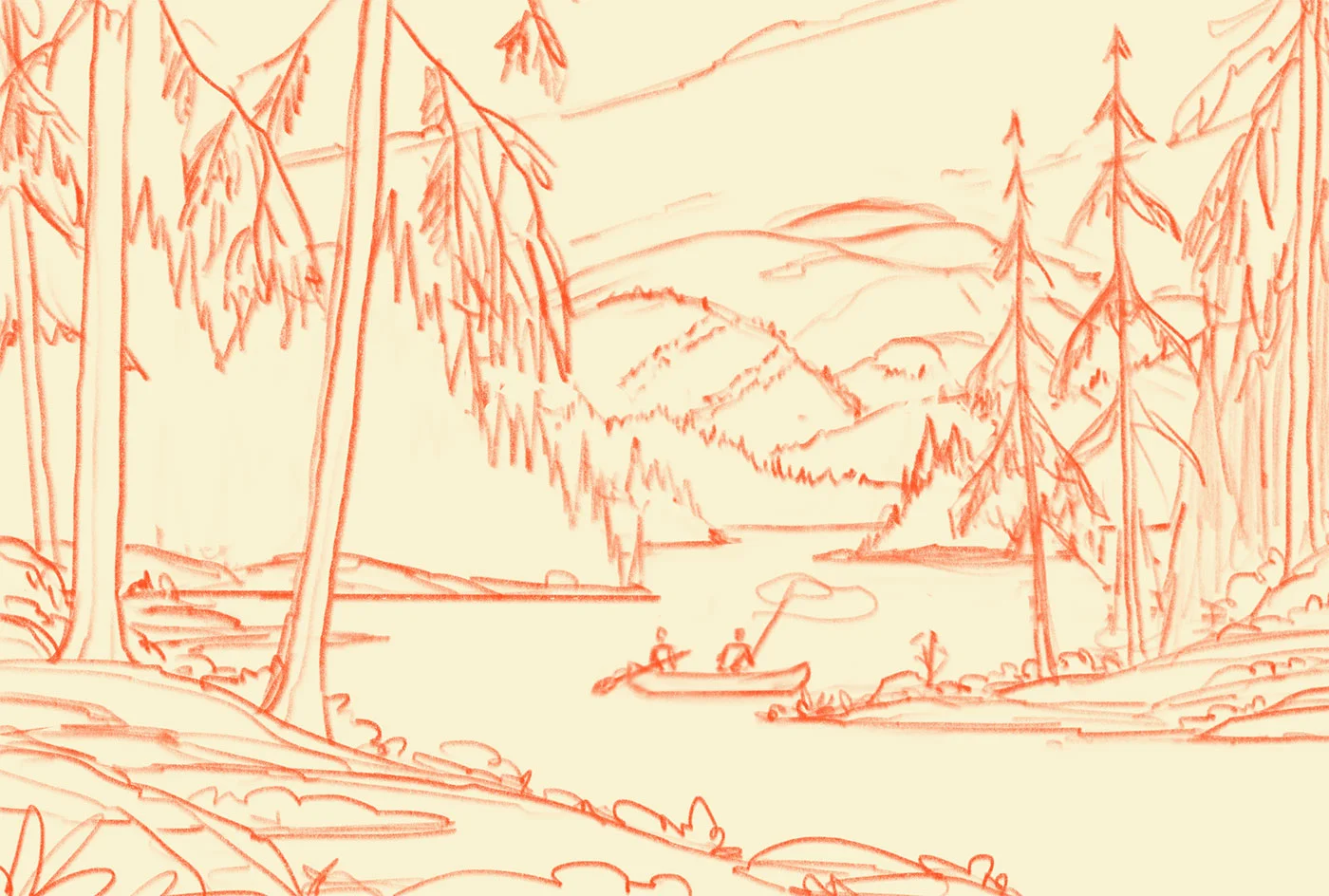
After reading the story and understanding the size of the article as well as the estimated placement of the article title, I did a few sketches using my trusty Col-Erase blue & red pencils on cheap printer paper. I find cheap printer paper ideal for sketching because it prevents me from being overly concerned with wasting materials as I search for my ideas. Here are the two ideas I came up with:
Thumbnail Comps
Roughs
Even though I could most likely use my thumbnail drawings to send to my clients, I like to tighten my rough sketches up in Photoshop and figure out placement of elements digitally. I always enjoy this transition from paper to digital so its a step I do more for myself. The more I enjoy the process, the better the results (usually).
Rough Sketch 1
Rough Sketch 2
Black & White Version
Once Russ approved the sketch, it was time for me to produce the final illustration. I've enjoyed working in black and white initially as part of my process for some time because it allows me to focus on a few elements at a time: composition, lighting, texture, etc. Since I'm working 100% digitally in Photoshop, I can control the color and placement with ease, making minor adjustments as needed.
Black & White
In Living Color
The black and white version helps to set the overall mood of the piece, but color is what helps draw out the tone and emotion in a more vivid way. Because color is so powerful in eliciting emotion, I like to focus on it exclusively in its own step in my process. Here are the two color options I developed for the story:
Color Option 1
Color Option 2
I left the final decision to Russ and with that, the illustration was completed. It was such a pleasure working on this piece in what turned out to be one of the most busy months of 2014. Thanks to Russ and the Field & Stream crew as well as my agent for working with me to create this one! I hope all of you enjoy it as much as I enjoyed creating it.